
CREATIVE DIRECTOR | WWW.ODDLOBBY.COM
ODD LOBBY

Project Mission
Odd Lobby is a creative house where artists come to create, collaborate, and grow. From music production and recording to content creation for artist.
The goal was to develop a complete brand identity that resonated with Los Angeles' diverse creative community, from singers and songwriters to producers and more. The brand needed to feel bold, modern, and collaborative.


Brand Strategy · Brand Identity · Creative Direction · Web Design · Graphic Design · Content Creation · Photography · Video · Community Development
Built the Foundation
While the original logo was provided, I refined it into a complete visual identity. I developed the brand strategy, muted black, red, and warm neutral palette, and design system for Odd Lobby.
The restrained colors created a strong, recognizable foundation without competing with the artists and their work, allowing the creative community to remain at the center of the brand.


Creative Direction
My role expanded beyond brand development. As Creative Director and Content Creator, I developed social media campaigns, promotional materials, posters, postcards, business cards, and marketing assets while helping shape the studio's broader creative direction and community presence.
The result was a cohesive identity that could move from the studio environment to social media, events, workshops, and promotional campaigns without losing its personality.


Real Moments
From the physical space to the visual storytelling, the creative direction brings Odd Lobby’s personality to life. This same warm, lived-in aesthetic carries through Facebook and Instagram ads, as well as organic Instagram content, capturing real moments, authentic energy, and the artists who bring the space to life.

BRAND DEVELOPMENT | WWW.ZENHEALINGRETREAT.COM
ZEN HEALING
Project Mission
Zen Healing Retreat is a post-operative luxury care center in Los Angeles, CA. Zen provides a serene and restful environment for healing after surgery.
The mission for the client was to create a strong, and memorable brand identity that will push brand awareness and growth past the current inner circle, and word of mouth clientele.


Brand Strategy · Market Research · Web Design · Print Design · Photography · Video · Creative Direction


From Logo to Brand
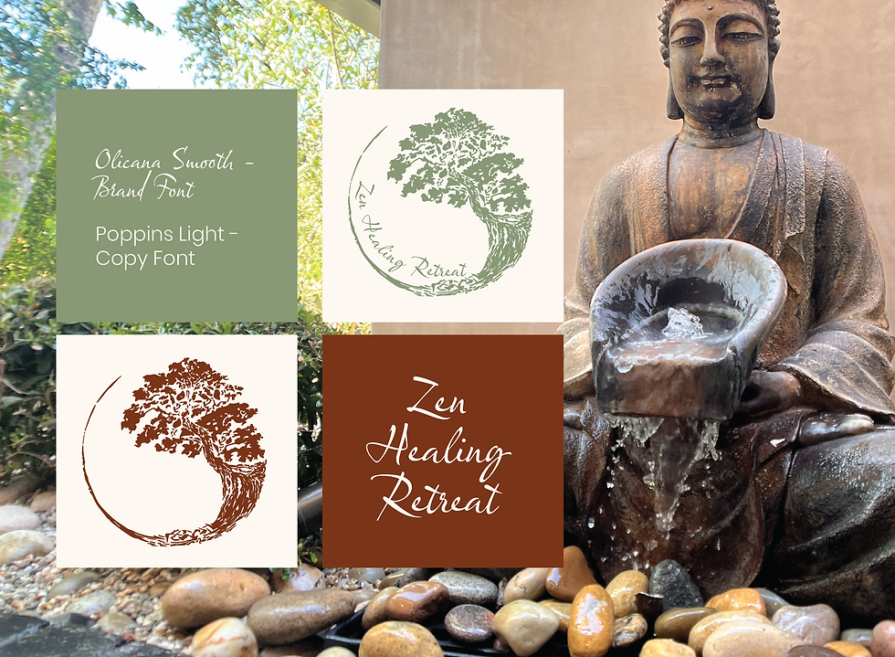
I was given a low-resolution logo to work with, which became the starting point for a full brand refresh. The original mark felt visually busy and slightly unbalanced, so I refined the existing concept through a more minimal approach.
From there, I developed a complete brand strategy and visual identity around the refined mark. The identity builds on the logo’s organic circular form and arch-like shape, creating a flexible visual language that carries across both digital and physical touchpoints. This became the foundation for everything from the website and printed materials to photography, video, and branded experiences.

From Logo to Brand
I was given a low-resolution logo to work with, which became the starting point for a full brand refresh. The original mark felt visually busy and slightly unbalanced, so I refined the existing concept through a more minimal approach.
From there, I developed a complete brand strategy and visual identity around the refined mark. The identity builds on the logo’s organic circular form and arch-like shape, creating a flexible visual language that carries across both digital and physical touchpoints. This became the foundation for everything from the website and printed materials to photography, video, and branded experiences.

Visual System
The visual system combines sage, soft cream, and rust with Olicana Smooth as the expressive brand font and Poppins Light as the clean supporting typeface. The contrast between the two creates a balance of warmth and professionalism, giving the identity a more personal, human quality while keeping the information clear and approachable across digital and physical touchpoints.
The laser-cut arch on the booklet cover, for example, creates depth while acting as a physical window into the brand experience.

Final Identity
The result was a warmer, more approachable visual presence that helped position Zen Healing as both a welcoming space for patients and a credible brand for professional partnerships.
The final identity brought a sense of calm, warmth, and intention to the entire brand experience. The client was delighted with how the vision came together, particularly in the physical materials, where the thoughtful details and tactile elements helped translate the feeling of healing into something tangible.


BRAND DEVELOPMENT | INSTAGRAM
US HEALTH FAIRS
Project Mission
A nonprofit public health organization providing accessible health services to under-resourced communities throughout Southern California.
The mission was to create a strong and memorable brand identity that increases awareness within both the healthcare community and the communities it serves.


Brand Refresh · Visual Identity · Creative Direction · Print Design · Photography · Content Creation · Market Research
Focus on Community
I was originally hired to refine the existing logo, shown above. The project quickly expanded into a full brand redesign, where I developed a cohesive visual identity across print and digital.
After researching healthcare organizations, community clinics, and nonprofit health initiatives, I developed a refreshed identity designed to feel modern, trustworthy, and approachable, while better reflecting the organization’s focus on care and community.
As part of the rebrand, I also developed US Health Fairs’ first tagline: “Connecting Communities to Care,” creating a clearer and more unified message across the brand.


Marketing Material
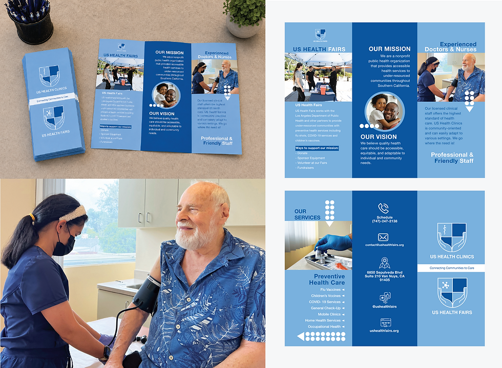
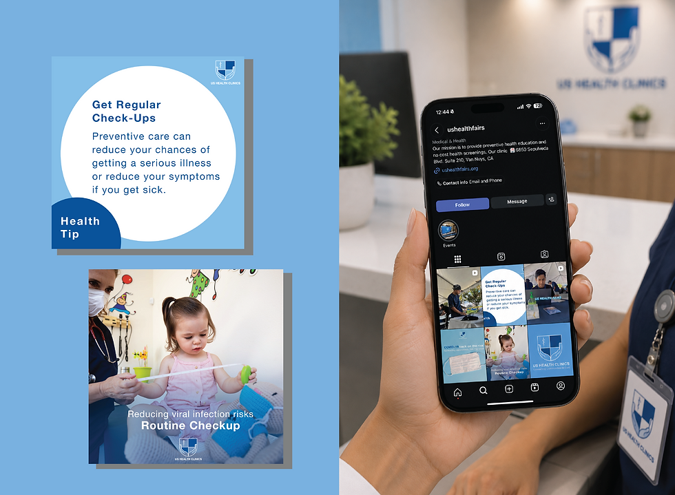
My role expanded beyond brand development into creative direction and content production. I organized and directed photoshoots, captured photography and video, and edited original content to build a visual library for the organization.
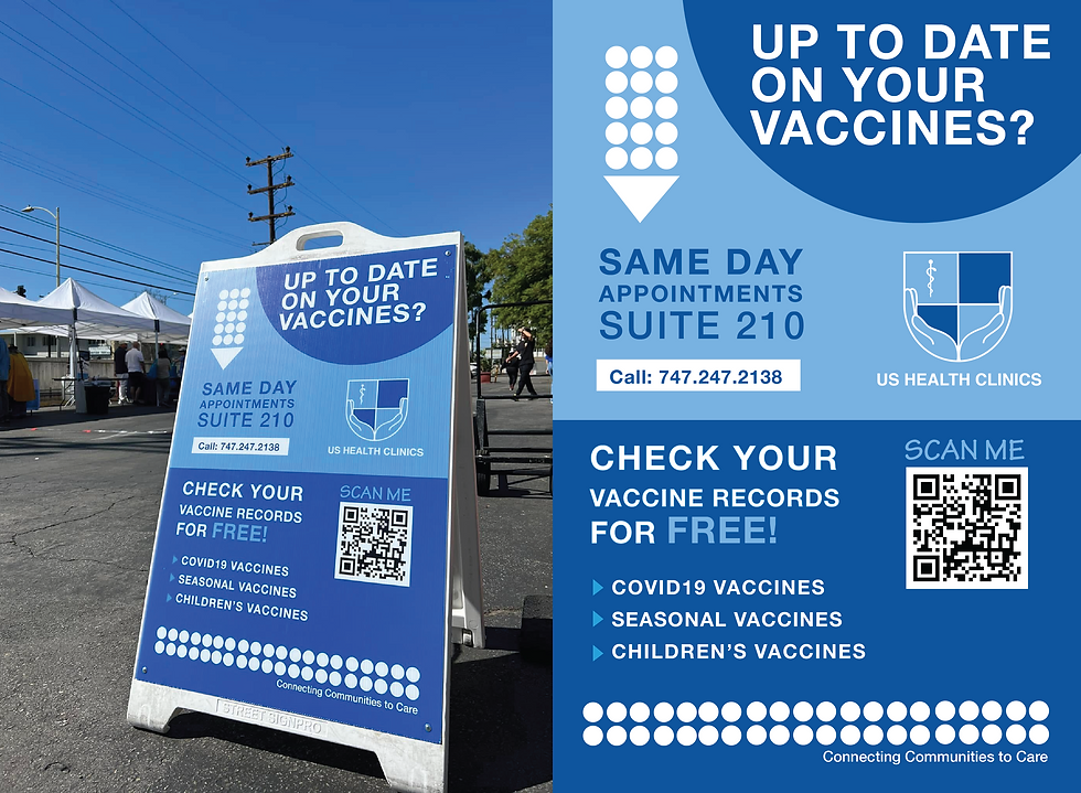
I also developed marketing materials such as posters, signs,, brochures, business cards, and social media assets.
A Healthcare Brand
The refreshed identity gave U.S. Health Fairs a clearer, more approachable way to communicate its mission and connect with the communities it serves. By bringing the logo, visual language, and digital content into alignment, the brand became more recognizable across its outreach and educational efforts.
The project was ultimately about more than a visual refresh, it was about creating a brand that could help make preventive healthcare feel more accessible, understandable, and human.


BRAND DEVELOPMENT | WWW.THEPACKWAYLA.COM
THE PACK WAY
Project Mission
Led the visual direction for The Pack Way, establishing a cohesive brand identity centered around connection, movement, and the human–dog bond.
To create a strong, and memorable brand identity that feels fun yet trust worthy. I decided to go for a 70's beach brand identity.


Brand Strategy · Visual Identity · Web Design · Photography · Marketing Collateral · Market Research
70's Beach Vibes
I designed the full brand identity for The Pack Way, including the logo and visual system. The customized Genty Demo wordmark takes a minimal yet playful approach, inspired by the relaxed energy of 1970s California beach culture.
I chose a rounded typography, a warm palette of sage, cream, and burnt orange, and a subtle leash detail woven into the “Y” create a nostalgic yet modern identity rooted in walking, movement, and life with your pack.


Creative Direction
I extended the identity into a Polaroid-inspired visual system, using the format across web content, marketing materials, and promotional assets. I also introduced a stamp-like treatment across handouts and business cards, giving the brand a tactile, collected feel that reflects the movement and adventure behind The Pack Way.
At Pack Walk events, we photographed owners with their dogs and provided Polaroid-style prints alongside a custom dog cookie, creating a memorable and tangible part of the customer experience.

Built Around Connection
I led the visual direction and photography, creating original content and marketing assets that carried the brand consistently across digital and physical touchpoints.
The Pack Way came together as a brand that celebrates the everyday relationship between people and their dogs. From the logo and visual identity to content and print, I built a cohesive system designed to feel approachable, and energetic.
Note: The website shown reflects my original design direction and brand implementation. Some elements have since been updated by the client.

CONCEPT BRAND
LILLE BARN
Project Mission
Lille Barn is a children’s boutique concept inspired by Scandinavian culture and design, created for design-conscious parents seeking thoughtful, playful pieces for their children.
The goal was to develop a realistic concept brand with a cohesive visual identity. Inspired by Scandinavian culture, the brand embraces nature, simplicity, and playful design.


Brand Strategy · Visual Identity · Illustration · Custom Typography · Apparel Design · Market Research
Custom Typography
I developed the identity from the ground up, beginning with hand-drawn sketches and Procreate before refining and vectorizing the artwork in Adobe Illustrator.
The custom typography and seed icon became the foundation of the visual language, representing growth, imagination, and childhood.


Creative Direction
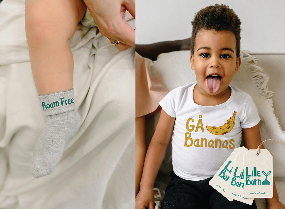
The creative direction blends Scandinavian simplicity with the imagination of childhood. Organic forms, playful illustrations and soft nature-inspired colors. I added playful clothing taglines like “Roam Free” and “Gå Bananas,” bringing a sense of adventure and a subtle nod to Swedish culture.
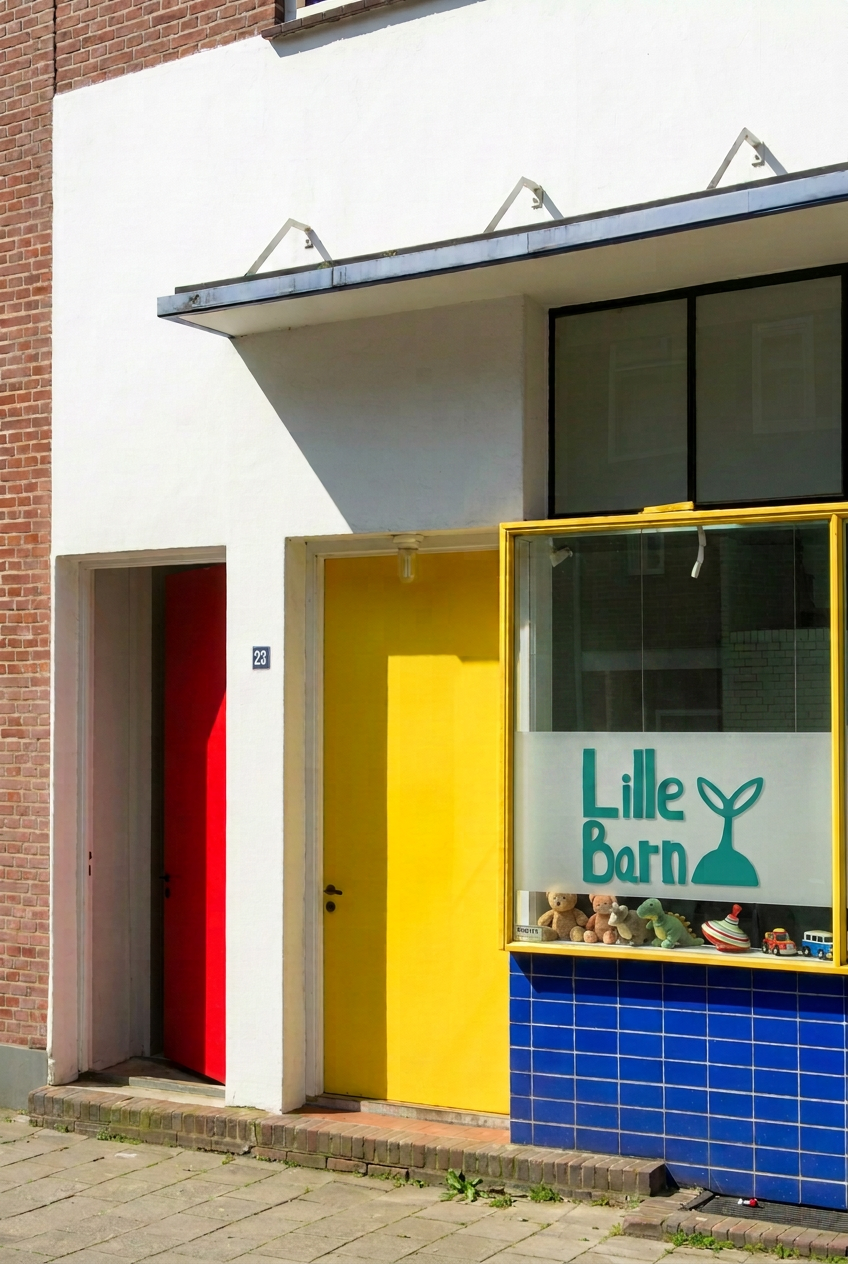
The identity comes to life across apparel, stickers, storefronts, social media, and playful brand details.
Scandinavian Roots
Lille Barn was developed as a concept with the potential to grow beyond a brand identity into a physical children’s boutique.
Rooted in Scandinavian design and culture, the concept could naturally translate into cities like Stockholm and Uppsala, while also resonating in markets such as Upstate New York, San Francisco, and Vancouver, places with strong Scandinavian ties and an appreciation for thoughtful, design-led, health-conscious living.


CONCEPT BRAND
HARVEST ROOTS
Project Mission
Inspired by my frequent visits to Ojai, California, Harvest Roots is a concept farm-to-table restaurant centered around fresh, organic ingredients.
The goal was to demonstrate how a single visual concept can create a cohesive and recognizable brand experience rooted in sustainability and honest, simple design.


Brand Strategy · Visual Identity · Custom Typography · Menu Design · Art Direction · Market Research
Logo Design
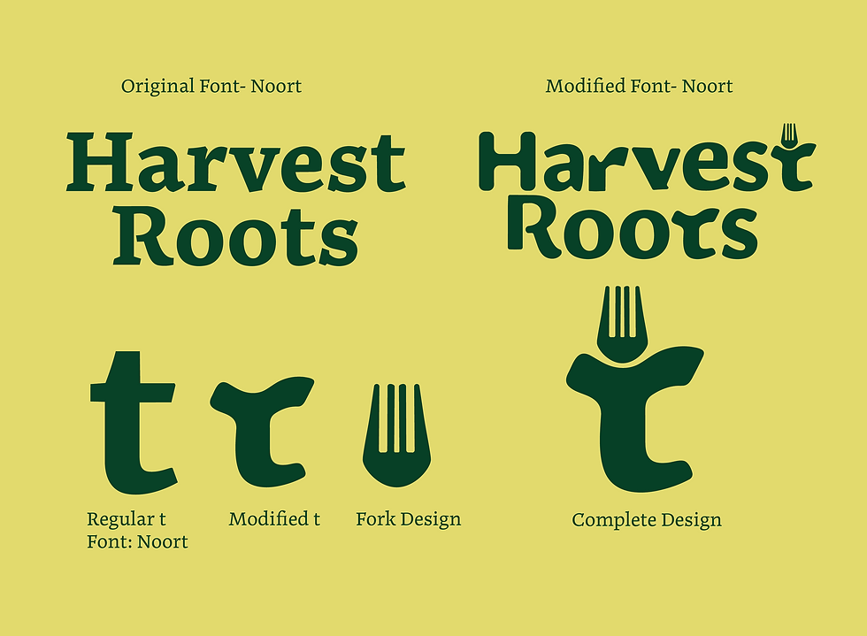
I customized the Noort typeface to create a distinctive wordmark, softening and rounding the letterforms to give the brand a more approachable personality.
I also transformed the “t” into a custom fork icon, creating a recognizable visual element that carries throughout the identity.


Visual System
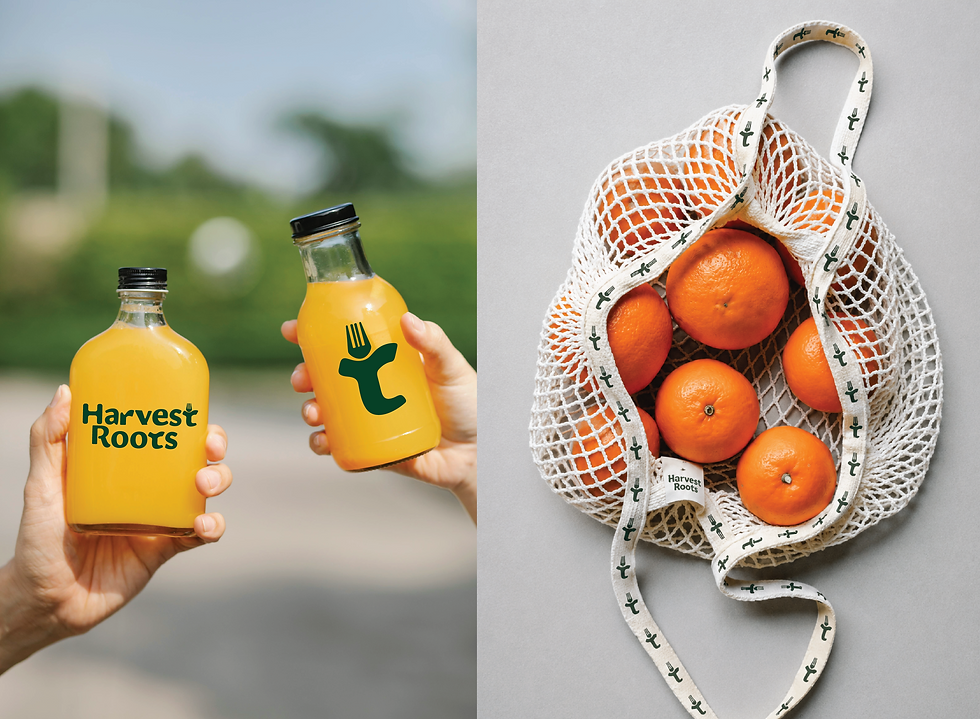
I extended the brand across merchandise, a rustic menu design, and social media, creating a visual language rooted in the colors, textures, and energy of farm-to-table dining.
The identity pairs a custom-made logo font with Noort Regular and Bold for supporting copy, balancing the playful character of the brand with a grounded feel.


Restaurant Identity
The result is a warm, inviting restaurant identity that captures the spirit of Ojai’s farm-to-table culture while creating a family-friendly, cohesive experience across the dining space and brand applications.